谈谈css3布局
在css2的布局之后,我们趁热打铁,开启css3中的布局,毕竟,时代在进步,浏览器也在升级换代,在良好的兼容性的铺垫下,更适合我们的技术将得到大力追捧。下面,介绍css3中的布局技术。
1.css3盒子模型
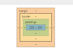
在介绍布局前,先介绍下盒模型。在css2中的W3C标准的盒模型,元素的高度(宽度)由content+padding+border来决定的。而传统的IE盒模型(IE6以下,不含IE6),元素的高度(宽度)只包含content。在CSS中,新增了一个盒模型属性box-sizing(content-box(默认) | border-box | inherit),用来解析盒模型是外盒模型还是内盒模型。
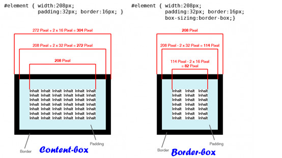
该图来自W3C官网,从图中可以得知,
当是content-box时,元素被解析为W3C的标准盒模型,元素的高度(height)等于内容高度(content)加上内边距高度(padding)加上边框高度(border)加上外边距高度(margin),宽度亦然。
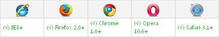
当是border-box时,元素就是IE传统的盒模型,高度就是元素的高度(content),宽度亦然。 我们在使用css3属性的时候,还得关注他的兼容性,如图是主流浏览器对box-sizing属性的兼容情况。 注:Mozilla Gecko引擎支持该属性时,需要添加私有属性。
2.多列布局
css3新增了多列布局,可以让浏览器自动将内容按指定的列数排列。
一、属性值
- columns: 集成column-width和column-count两个属性
- column-width: 定义每列宽度
- column-count: 定义列数
- column-gap: 定义列间距
- column-rule: 定义列边框
- column-span: 定义布局中子元素跨列效果
- column-fill: 定义每列列高效果
columns:
*{padding:0px;margin:0px;}
.box{-moz-columns:100px 4;-webkit-columns:100px 4;columns:100px 4;}<div class="box">
<h1>标题</h1>
<p>这里是内容!这里是内容!这里是内容!这里是内容!这里是内容!这里是内容!这里是内容!这里是内容!这里是内容!</p>
<p>这里是内容!这里是内容!这里是内容!这里是内容!这里是内容!这里是内容!这里是内容!这里是内容!这里是内容!</p>
<p>这里是内容!这里是内容!这里是内容!这里是内容!这里是内容!这里是内容!这里是内容!这里是内容!这里是内容!</p>
<p>这里是内容!这里是内容!这里是内容!这里是内容!这里是内容!这里是内容!这里是内容!这里是内容!这里是内容!</p>
</div>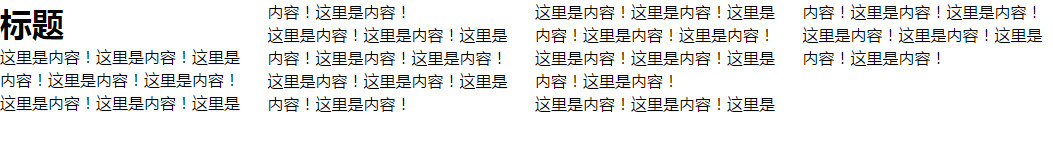
注:当列宽足够大时,以至于无法分列显示时,就算有列数、列间距,也将以一行显示。 这样,多列布局就可以轻松地实现了。
column-width: auto |
其中当是auto时,有列数来决定,length不可以是负数。
column-count: auto |
column-gap: normal |
*{padding:0px;margin:0px;}
.box{width:40em;
     -moz-column-count:4;-webkit-column-count:4;column-count:4;
     -moz-column-gap:2em;-webkit-column-gap:2em;column-gap:2em;
-moz-column-width:8.5em;-webkit-column-width:8.5em;column-width:8.5em;}<div class="box">
<h1>标题</h1>
<p>这里是内容!这里是内容!这里是内容!这里是内容!这里是内容!这里是内容!这里是内容!这里是内容!这里是内容!</p>
<p>这里是内容!这里是内容!这里是内容!这里是内容!这里是内容!这里是内容!这里是内容!这里是内容!这里是内容!</p>
<p>这里是内容!这里是内容!这里是内容!这里是内容!这里是内容!这里是内容!这里是内容!这里是内容!这里是内容!</p>
<p>这里是内容!这里是内容!这里是内容!这里是内容!这里是内容!这里是内容!这里是内容!这里是内容!这里是内容!</p>
</div>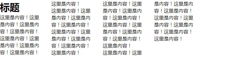
如图,我们在计算列宽度时,列宽度=(总宽度-所有列间距)/ 列数。
column-rule:
column-rule-width类似于border-width属性,主要用于定义列边框的宽度,默认值是medium,该值可以接受任意浮点数(非负),也可以使用关键字medium,thick,thin。
column-rule-style用来定义列边框样式,默认是none。该属性值包括none、hidden、dotted、dashed、solid、double、groove、ridge、inset、outset。 column-rule-color用来定义列边框的颜色,也可设置成透明色。
*{padding:0px;margin:0px;}
.box {width: 40em;
      -moz-column-count: 4;-webkit-column-count: 4;column-count: 4;
      -moz-column-gap: 2em;-webkit-column-gap: 2em;column-gap: 2em;
-moz-column-rule: 2px solid red;-webkit-column-rule: 2px solid red;column-rule: 2px solid red;}<div class="box">
<h1>标题</h1>
<p>这里是内容!这里是内容!这里是内容!这里是内容!这里是内容!这里是内容!这里是内容!这里是内容!这里是内容!</p>
<p>这里是内容!这里是内容!这里是内容!这里是内容!这里是内容!这里是内容!这里是内容!这里是内容!这里是内容!</p>
<p>这里是内容!这里是内容!这里是内容!这里是内容!这里是内容!这里是内容!这里是内容!这里是内容!这里是内容!</p>
<p>这里是内容!这里是内容!这里是内容!这里是内容!这里是内容!这里是内容!这里是内容!这里是内容!这里是内容!</p>
</div>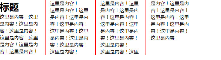
2px红色实线的列边框就这样实现了。
注:column-rule-width的增大不会影响列的布局,他不占任何空间位置;column-rule在Z轴上是介于background和content之间的,但是column-rule-width的宽度增加至大于列与列之间的间距时,列边框会自动消失。
column-span: none | all 用于定于子元素能够跨多少列。有些子元素标题是不能进行跨列的,就可以用该属性来实现。
*{padding:0px;margin:0px;}
.box {width: 40em;
      -moz-column-count: 4;-webkit-column-count: 4;column-count: 4;
      -moz-column-gap: 2em;-webkit-column-gap: 2em;column-gap: 2em;
      -moz-column-rule: 2px solid red;-webkit-column-rule: 2px solid red;column-rule: 2px solid red;}
.box > h1{column-span:all;text-align:center;}<div class="box">
<h1>标题标题标题标题</h1>
<p>这里是内容!这里是内容!这里是内容!这里是内容!这里是内容!这里是内容!这里是内容!这里是内容!这里是内容!</p>
<p>这里是内容!这里是内容!这里是内容!这里是内容!这里是内容!这里是内容!这里是内容!这里是内容!这里是内容!</p>
<p>这里是内容!这里是内容!这里是内容!这里是内容!这里是内容!这里是内容!这里是内容!这里是内容!这里是内容!</p>
<p>这里是内容!这里是内容!这里是内容!这里是内容!这里是内容!这里是内容!这里是内容!这里是内容!这里是内容!</p>
</div>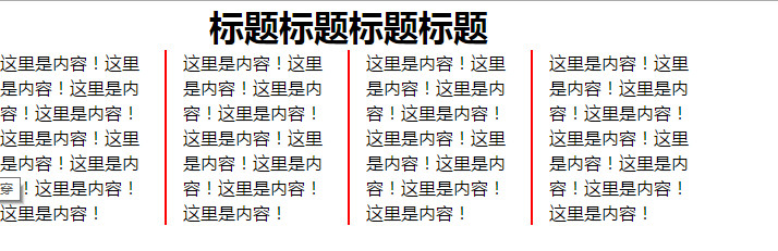
这样就很容易实现一个跨列的标题了。
column-fill: auto | balance
设置每列的高度效果。auto是默认值,各列的高度会随着内容的变化而变化,而balance则会根据内容最多的一列的高度进行统一。 多列布局的兼容性,各主流浏览器的支持情况:
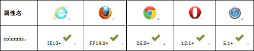
IE的话,必须至少IE10,看来只能在移动端使用这个属性了。。
3.Flexbox布局
CSS3中引入了一种新的布局模式,Flexbox布局,即伸缩布局盒模型。常规的布局中,块级从上到下,内联从左到右,他们在渲染树中的位置就是文档中的位置,而Flexbox布局的方向是未知的,并且会不同于文档中的元素排列顺序。
其实,Flexbox布局已经经历过好几个阶段了,可以大致分为旧版本(2009)、混合版本(2011)、最新版本,在此,仅仅介绍由W3C推出的最新版本的语法规则。
伸缩布局
display: flex | inline-flex 可将元素设置成块级伸缩容器和内联伸缩容器。
注:float、clear、vertical-align在伸缩容器上没有效果。
<style type='text/css'>
.flexbox{display:flex;}
.flexbox > div{width:100px;height:100px;border:1px solid #ccc;}
</style>
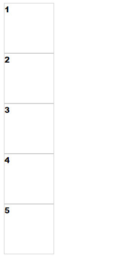
<div class="flexbox">
<div>1</div>
<div>2</div>
<div>3</div>
<div>4</div>
<div>5</div>
</div>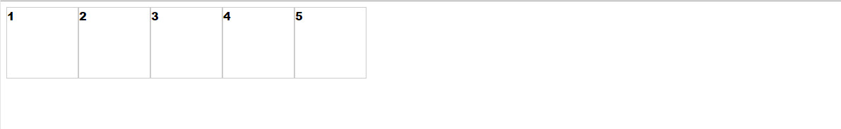
伸缩流方向 flex-direction
该属性适用于伸缩容器,主要用来创建主轴,从而定义伸缩容器的方向。
flex-direction: row | row-reverse | column | column-reverse
- row:在ltr排版时从左向右,rtl排版时从右向左,默认是row
- row-reverse:方向与row相反
- column:与row类似,但从上到下
- column-reverse:方向与column相反
row效果同前一张图
.flexbox{display:flex;flex-direction: row-reverse;}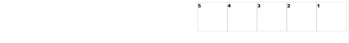
.flexbox{display:flex;flex-direction: column;}
```css
```css
.flexbox{display:flex;flex-direction: column-reverse;}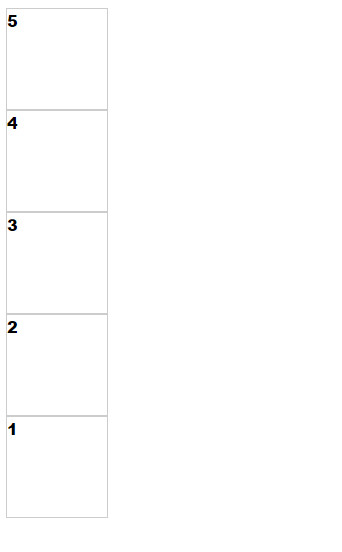
伸缩换行 flex-wrap
该属性适用于伸缩容器,用于定义伸缩容器是单行还是多行显示的,决定新行的堆放方向。
flex-wrap: nowrap | wrap | wrap-reverse
- nowrap:伸缩容器单行显示(默认)
- wrap:伸缩容器多行显示
- wrap-reverse:伸缩容器多行显示,方向与wrap相反
.flexbox{display:flex;flex-wrap: nowrap;} // 此处没有修改div的宽度,只是将浏览器的宽度缩小了。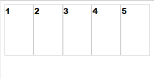
.flexbox{display:flex;flex-wrap: wrap;} // 父元素的宽度不够,就被挤到下一行了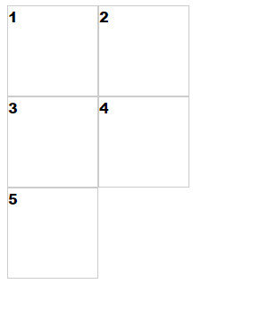
.flexbox{display:flex;flex-wrap: wrap-reverse;}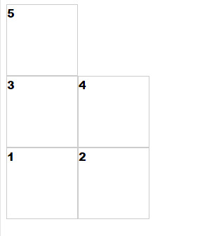
伸缩流方向与换行 flex-flow
该属性适用于伸缩容器,同时定义flex-direction和flex-wrap属性。
flex-flow: <'flex-direction'> || <'flex-wrap'>
主轴对齐方向
该属性适用于伸缩容器,用来定义伸缩容器沿主轴的对齐方式,会对不能伸缩和达到伸缩的进行一些控制。
justify-content: flex-start | flex-end | center | space-between | space-around
- flex-start:向一行的起始位置靠齐(默认)
- flex-end:向一行的结束位置靠齐
- center:向一行的中间位置靠齐
- space-between:伸缩容器中的各项会平局分布,第一个在初始位置,最后一个在结束位置
- space-around:伸缩容器中的各项会平局分布,两端会留空
.flexbox{display:flex;justify-content: flex-start;}
.flexbox{display:flex;justify-content:flex-end;}
.flexbox{display:flex;justify-content:center;}
.flexbox{display:flex;justify-content:space-between;}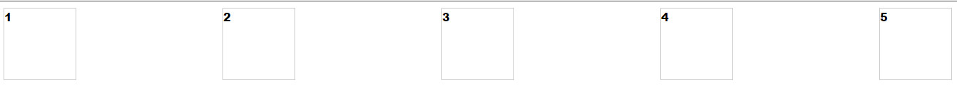
.flexbox{display:flex;justify-content:space-around;}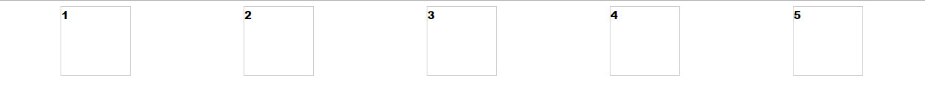
侧轴对齐align-items和align-self
align-items控制伸缩容器的侧轴对齐方式,align-self控制伸缩容器中的项目的侧轴对齐方式。
align-items: flex-start | flex-end | center | baseline | stretch
- flex-start:伸缩容器内的项目的侧轴起始边的外边距紧靠着该行的侧轴起始边
- flex-end:伸缩容器内的项目的侧轴结束边的外边距紧靠着该行的侧轴结束边
- center:伸缩容器内的项目在侧轴上居中放置
- baseline:伸缩容器内的项目在侧轴上按基线对齐
- stretch:伸缩容器内的项目拉伸填满整个伸缩容器(默认)
修改各个项目的高度。
<div class="flexbox">
    <div style="height: 50px;">1</div>
    <div style="height: 120px">2</div>
    <div style="height: 100px;">3</div>
    <div style="height: 170px;">4</div>
    <div style="height: 150px;">5</div>
</div>.flexbox{display:flex;height:200px;border:1px solid blue;align-items:flex-start;}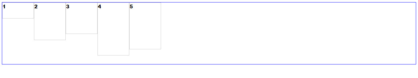
.flexbox{display:flex;height:200px;border:1px solid blue;align-items:flex-end;}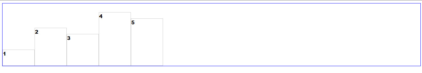
.flexbox{display:flex;height:200px;border:1px solid blue;align-items:center;}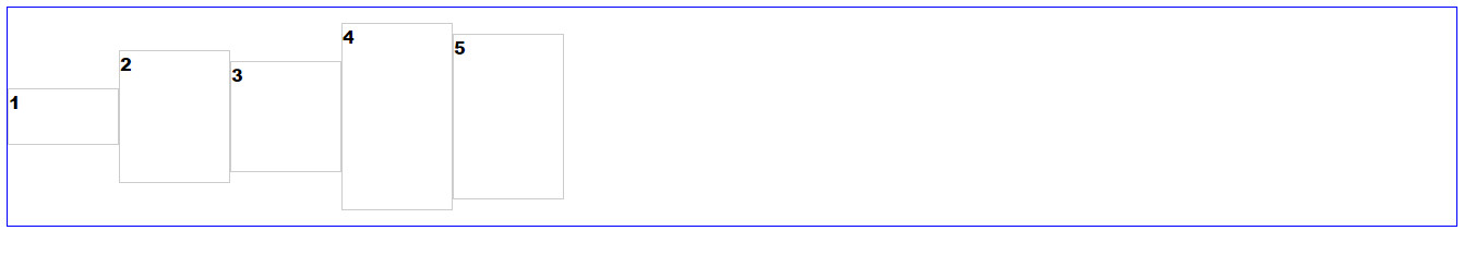
.flexbox{display:flex;height:200px;border:1px solid blue;align-items:baseline;}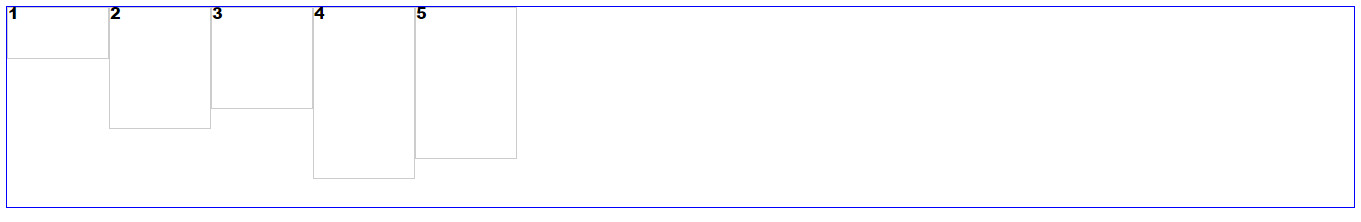
.flexbox{display:flex;height:200px;border:1px solid blue;flex-flow:row wrap;align-items:stretch;}
 // 注:此处伸缩容器内的项目的高度不能设定,否则会无效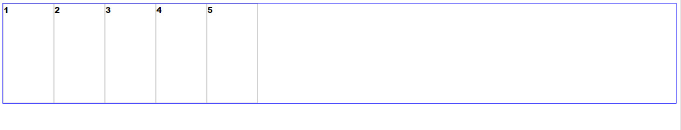
align-items
.flexbox{display:flex;height:200px;border:1px solid blue;flex-flow:row wrap;}
.flexbox > div:nth-child(1){width:100px;height:100px;border:1px solid #ccc;align-self:flex-start;}
.flexbox > div:nth-child(2){width:100px;height:100px;border:1px solid #ccc;align-self:flex-end;}
.flexbox > div:nth-child(3){width:100px;height:100px;border:1px solid #ccc;align-self:center;}
.flexbox > div:nth-child(4){width:100px;height:100px;border:1px solid #ccc;align-self:baseline;}
.flexbox > div:nth-child(5){width:100px;border:1px solid #ccc;align-self:stretch;}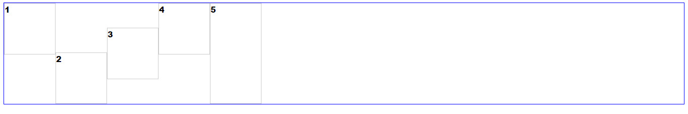
堆栈伸缩行 align-content
该属性会改变flex-wrap的行为,和align-items相似,但不是对齐伸缩容器中得项目,而是对齐的伸缩行。
align-content: flex-start | flex-end | center | space-between | space-around | stretch- flex-start:各行向伸缩容器的起始位置堆叠
- flex-end:各行向伸缩容器的结束位置堆叠
- center :各行向伸缩容器的中间位置堆叠
- space-between:各行在伸缩容器中平局分布,第一和最后与容器之间没有空隙
- space-around:各行在伸缩容器中平局分布,第一和最后与容器之间有空隙
- stretch:各行会伸展以占用额外空间(默认)
先修改样式,
.flexbox{display:flex;height:500px;width:208px;border:1px solid blue;flex-direction:row;flex-wrap:wrap;align-content:flex-start;}
.flexbox > div{height:100px;width:102px;border:1px solid #ccc;}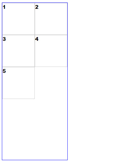
.flexbox{display:flex;height:500px;width:208px;border:1px solid blue;flex-direction:row;flex-wrap:wrap;align-content:flex-end;}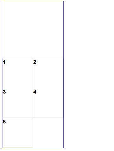
.flexbox{display:flex;height:500px;width:208px;border:1px solid blue;flex-direction:row;flex-wrap:wrap;align-content:center;}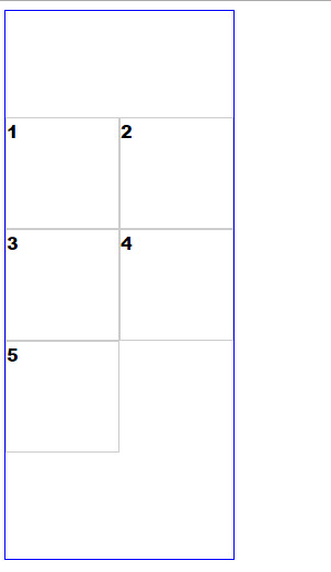
.flexbox{display:flex;height:500px;width:208px;border:1px solid blue;flex-direction:row;flex-wrap:wrap;align-content:space-between;}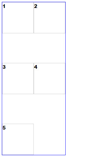
.flexbox{display:flex;height:500px;width:208px;border:1px solid blue;flex-direction:row;flex-wrap:wrap;align-content:space-around;}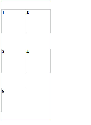
.flexbox{display:flex;height:500px;width:208px;border:1px solid blue;flex-direction:row;flex-wrap:wrap;align-content:stretch;}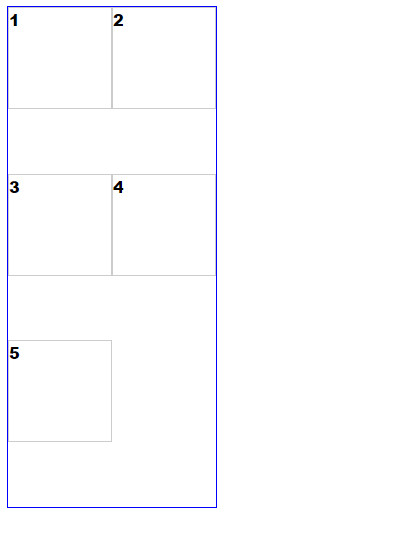
伸缩性 flex
伸缩布局的伸缩性是让伸缩项目可伸缩,也就是让伸缩项目的宽度或高度自动填充额外的空间,可用flex属性完成。伸缩容器会等比地按照比率分配额外的空间,也会按比例缩小项目的大小避免溢出。
flex: none | [<'flex-grow'> <'flex-shrink'> ? || <'flex-basis'>]
三个值对应的分别是扩展比例、收缩比例和伸缩基准值。当一个元素是伸缩项目时,flex属性将代替主轴长度属性决定元素的主轴长度。若不是,则无效。
flex-grow:
(默认值为0) 当flex-grow设置为1时,每个伸缩项目将设置一个大小相等的额外空间。若为2,则该项目的额外空间是其他项目的2倍。
flex-shrink:
该属性用来定义项目的收缩能力,负值同样生效。
flex-basis:
该值作为伸缩的基准值,若设置为auto,则基准值是元素主轴长度属性值。
<style type='text/css'>
.flexbox{display:flex;height:200px;flex-direction:row;flex-wrap:nowrap;}
.flexbox > div:nth-child(1){height:200px;background-color:blue;flex:1 100px;}
.flexbox > div:nth-child(2){height:200px;background-color:olive;flex:2 100px;}
.flexbox > div:nth-child(3){height:200px;background-color:pink;flex:3 100px;}
</style>
</head>
<body>
<div class="flexbox">
    <div style="">1</div>
    <div style="">2</div>
    <div style="">3</div>
</div>
</body>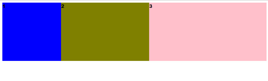
我们来看下第一个div的宽度,
200px,比原先多了100px,由于现在比例是1:2:3,所以我们很容易的得出第二个、第三个div得到了额外的200px、300px空间,第二个div的信息:
第三个div:
显示顺序 order
默认状态下,元素是按照文档流的结构顺序排列的,在flexbox模型中,我们可以通过order属性改变源文档中的次序。
order:
伸缩布局中,order属性控制项目在伸缩容器中的次序,从序号最小的开始。还是刚才的文档结构,css中加入order属性:
.flexbox{display:flex;height:200px;flex-direction:row;flex-wrap:nowrap;}
.flexbox > div:nth-child(1){height:200px;background-color:blue;flex:1 100px;order:2;}
.flexbox > div:nth-child(2){height:200px;background-color:olive;flex:2 100px;order:3;}
.flexbox > div:nth-child(3){height:200px;background-color:pink;flex:3 100px;order:1;}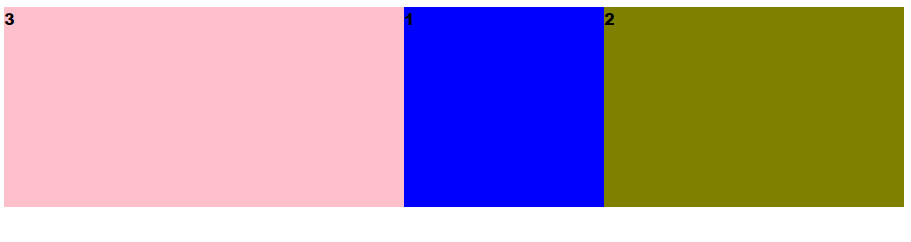
顺序是按order从小到大排列。
兼容性
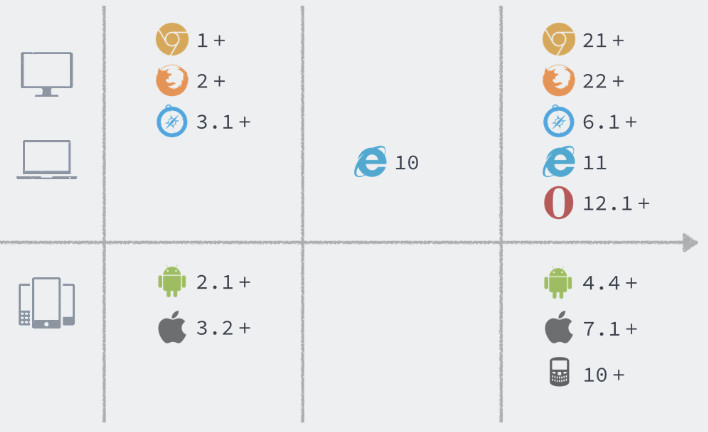
该图列出了flexbox3个版本的支持情况,webkit内核还需要使用前缀-webkit-(版本50.0.2661.87已经不要了),混合版本浏览器兼容性相对来说要简单些,因为IE10一直支持这个版本。
4.响应式布局
响应式布局可以利用CSS3中新增的媒体查询功能(Media Query)。讲媒体查询前,先讲下,媒体类型。
在CSS2中,媒体类型是一个很常见的属性,当然也非常有用。我们经常会遇到all、screen、print(最常见的)这些媒体类型。W3C共列出了10种媒体类型:
- all 所有的设备
- braille 盲人用点字法触觉回馈设备
- embossed 盲人打印机
- handheld 便携设备
- print 打印用纸或打印预览图
- projection 各种投影设备
- screen 电脑显示器
- speech 语音或音频合成器
- tv 电视机类型设备
- tty 使用固定密码字母栅格的媒介,比如电传打印机和终端
引用媒体的方法,常见的有link标签、xml形式、@import和@media这几种方法。
link标签
我们经常会引入不同的CSS文件,而可以通过link标签中的media属性来指定不同的媒体类型。
<link rel="stylesheet" type="text/css" href="./index.css" media="screen" />xml方式
与link标签引入非常的相似,
<?xml-stylesheet rel="stylesheet" media="screen" href="./index.css" ?>@import方式
该方式常常被用来引入CSS文件,当然也是不推荐此方法的,因为会存在兼容性问题(IE7及以下不支持),而link标签则不会有。以下是import引入的两种方式。
@import url(index.css) screen;
<style type="text/css">
    @import url(style.css) all;
</style>
@media方式
@media是CSS3中的一个新的特性,当然也是本段落的主角。当然,该方法与@import方式比较像。
/* 在样式文件中使用 */
@media screen {
    /* 样式代码 */
}
<style type="text/css">
@media screen {
    /* 样式代码 */
}
</style>
那么,Media Query又是如何使用的呢?
首先是常见Media Query设备特性。
特性
合理的特性值
是否支持 max/min
说明
width
带单位的长度值,如100px
是
匹配浏览器宽度
height
带单位的长度值,如100px
是
匹配浏览器高度
aspect-ratio
比例值,如 16/9
是
匹配浏览器的宽度值和高度值的比例
device-width
带单位的长度值,如100px
是
匹配设备分辨率的宽度值
device-height
带单位的长度值,如100px
是
匹配设备分辨率的高度值
device-aspect-ratio
比例值,如 16/9
是
匹配设备分辨率的宽度值与高度值的比例
color
整数值
是
匹配设备使用多少位的色深,比如真彩色是32,如果不是彩色设备则为 0
color-index
整数值
是
匹配色彩表中的颜色数
monochrome
整数值
是
匹配单色帧缓冲器中每像素的位(bit)数,如果不是单色设备,这个数值为 0
resolution
分辨率,如300dpi
是
匹配设备的物理分辨率
scan
只能是 progressive 或者 interlace
否
匹配设备的扫描方式,其中 progressive 代表逐行扫描, interlace 代表隔行扫描
grid
只能是 0 或 1
否
匹配设备是否基于栅格,1代表基于栅格,0代表其他类型
使用方法
格式如,@media 媒体类型 and (媒体特性) {样式} 注:媒体特性中的特性与值,之间必须使用冒号分隔。
最大宽度 max-width
意思是指媒体类型小于或等于指定的宽度时,样式生效,以下表示当屏幕小于或等于480px时,box类的背景色变为#ccc。
@media screen and (max-width: 480px) {
    .box {
        background-color: #ccc;
    }
}
最小宽度 min-width
档媒体类型大于或等于指定宽度时,样式才会生效。
@media screen and (min-width: 960px) {
    .box {
        background-color: #ccc;
    }
}
多个媒体属性同时使用
可以使用关键字and将多个媒体特性连接在一起,当宽度在300px~680px之间时,样式生效。
@media screen and (min-width: 300px) and (max-width: 680px) {
    .box {
        background-color: #ccc;
    }
}
Device Width智能设备
在智能设备上,如手机、平板上,对于屏幕同样可以使用min/max对应的参数,如min-device-width或max-device-widhth,用法同前。
not关键字
not用来排除某种媒体类型,是对表达式进行取反操作。
@media not print and (max-width: 1000px) {
    /*样式*/
}
only关键字
only用来指定某种媒体类型,可用于排除不支持媒体查询的浏览器。
<link rel="stylesheet" media="only screen and......" href="....." />其他注意点(移动端)
meta标签
用智能手机登录一个pc端的网页,通常看到的是一个整体页面缩小后的样子(媒体查询也无效)。是因为,手机的分辨率要比pc的分辨率高,为了让页面在手机上正常显示。可以引入一个特殊的meta标签。使用方法如下,
<meta name="viewport" content="" />content属性中可以填入以下属性值:
Content属性值
功能描述
width, 可视区域的宽度,值可以是一个具体数字或关键字device-width
height,可视区域的高度,值可以是一个具体数字或关键字device-height
initial-scale,页面首次被显示时可视区域的缩放级别,取值为1.0则页面按照实际尺寸显示,无缩放
minimun-scale,可视区域最小的缩放级别,取值1.0时禁止用户缩小至实际尺寸以下
maximun-scale,可视区域最大的缩放级别,取值1.0时禁止用户放大至实际尺寸以上
user-scalable,指定用户是否可以对页面进行缩放,设置yes允许,no为禁止缩放
如非常流行的响应式框架bootstrap中的meta标签:
<meta name="viewport" content="width=device-width, initial-scale=1">当然,pc上的1px与智能设备上的1px是不相同的。
兼容性
响应式布局需要结合media query才能更好的实现,所以浏览器必须支持CSS3 Medai Query。显然,IE8-不支持,为了使这些浏览器支持,可以像bootstrap一样加入以下脚本:
   <!--\[if lt IE 9\]>
      <script src="http://cdn.bootcss.com/html5shiv/3.7.2/html5shiv.min.js"></script>
      <script src="http://cdn.bootcss.com/respond.js/1.4.2/respond.min.js"></script>
    <!\[endif\]-->
这样的话,低版本的IE也是能够支持这一属性了。
当然,CSS3中的布局还没有结束,介绍的仅仅是比较常用的,毕竟CSS还是在发展的。